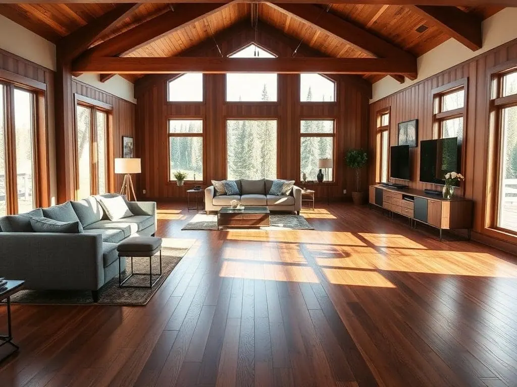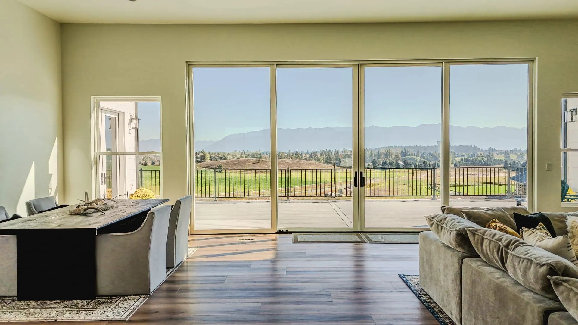
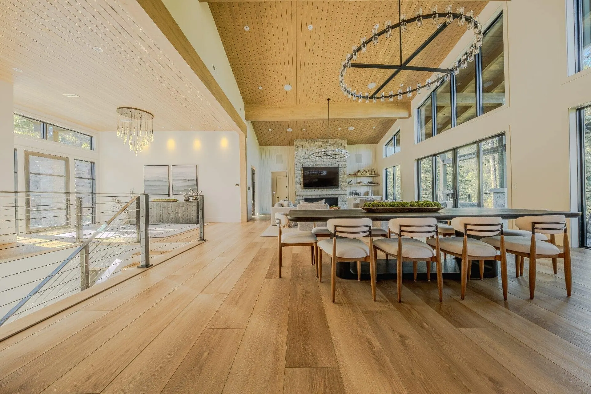
Mountain modern interior design combines clean contemporary lines with warm wood, stone or stone-look surfaces and a restrained palette. Start with the floor, compare countertop and tile samples beside it, and use texture and layered lighting to connect the room. Material choices still need to suit moisture, entry grit, heating conditions and the selected product’s care instructions.
This is a finish-selection guide, written from the material side. Northern Lights Design supplies flooring, tile, stone, and slabs; we are not architects or interior designers, and we work alongside whoever is designing and installing your project. What we can do is help the materials agree with each other.
Start with a restrained palette
The most common mistake is variety. Mountain modern reads calm because it repeats a small number of materials at a large scale.
A workable structure:
- One dominant warm neutral across the largest surfaces — floor and walls.
- One wood tone, used consistently. If the floor is warm white oak, cabinetry and beams should sit in the same family rather than introducing a second, competing brown.
- One stone or stone-look character for counters, fireplace, and any feature wall.
- One or two accents — a blackened metal, an aged brass, a deep green or charcoal — and nothing else.
Warm neutrals have replaced the cool grays and whitewashed woods of the last decade in the projects we supply, and warm tones age far better next to real wood and stone. Our 2026 finishes article covers where that palette is heading.
Let texture do the work instead of pattern
When the palette is quiet, texture carries the room.
- Matte and honed over polished. High gloss reads dated in mountain interiors and shows every fingerprint and water spot.
- Wire-brushed and light-character wood. Grain and figure are the point of real wood — see hardwood and engineered hardwood.
- Split-face, ledger, and leathered stone for fireplaces and feature walls: natural stone.
- Large-format tile keeps grout lines from competing in tall rooms; save small mosaics for niches and bath floors. Browse porcelain and the wider tile and stone range.
- Textiles and rugs are where softness belongs, not in a busy tile pattern. See area rugs.
Layer the light, then judge the finishes
Mountain modern interiors have big glass, dark winters, and long shadows. A single ceiling fixture per room will make expensive materials look cheap.
Plan three layers: ambient, task, and accent. Then pay attention to color temperature — pick one for the whole house, in the warm range, and keep it consistent. Cool light turns warm wood and greige stone gray-green.
Grazing light across a split-face fireplace or a wire-brushed floor is what makes texture visible. Flat overhead light erases it.
Build the winter entry for winter
An entry is where mountain modern designs most often lose to Montana. Snowmelt, gravel, and ice-melt salt come through that door for five months.
- Textured through-body porcelain or dense stone-look tile at the floor, not polished stone.
- Mid-tone grout, generously sized mats inside and out, and a bench with tile behind it.
- Continue the palette here — the entry should look like the rest of the house, just built tougher.
Our mudroom tile guide and durability guide go deeper.
Coordinate flooring, tile, and countertops as one decision
Choose these together, in this order, and the palette holds:
- Floor first. It is the largest surface and the hardest to change.
- Counters second, against the floor sample. See countertops, quartz, granite, and marble.
- Tile last, to bridge the two. Backsplash and bath tile should connect the counter's tone to the floor's, not introduce a third story.
Check undertones, not just lightness. A greige floor with a pink-beige counter will fight even though both photograph as neutral. Compare vinyl vs tile for underfoot feel and room requirements, then use our Cambria vs Caesarstone vs Silestone comparison for surface and maintenance distinctions. Once tile is selected, the tile calculator gives an initial quantity estimate for installer review.
Test samples the way the room will actually see them
Catalog photos and showroom lighting are not your house.
- Take large samples, not chips, and take more than one option.
- Lay them flat on the floor for flooring and horizontal for counters — vertical viewing lies.
- Look at them at morning, midday, and after dark under your own lights.
- View them next to the actual cabinet door and paint sample, not from memory.
- Live with them for several days before deciding.
Mountain modern interior design, room by room
Mountain modern interior design works best when each room's surfaces are chosen for how the room is used. Main living areas often start with a warm, matte wood floor, from hardwood flooring or a wood-look luxury vinyl where moisture or pets are a concern. Entries and baths lean on textured porcelain or stone from tile and stone, and kitchens bring in a honed or matte counter that agrees with both. Pick each material for its room conditions and care instructions first, then check that the set reads as one palette.
Bring it to the showroom
The fastest version of all of this is an hour in the showroom with your plans. Bring floor plans, cabinet and paint samples, any inspiration images, and your list of rooms that take hard use, and we will talk through the palette and the material trade-offs with you. Visit our Kalispell or Lakeside showroom, browse the gallery, or book a showroom visit and take samples home.